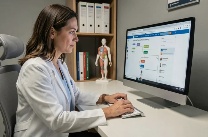
A physiotherapist looking for a knee rehabilitation protocol in an online physiotherapy magazine won’t read the table of contents from top to bottom. They’ll type a couple of words into the search bar or browse by category.
When neither option works properly, the sitemap becomes the last resort. But it needs to be easy to read, well structured and accessible, including for people who navigate with a keyboard or screen reader.
Physiotherapy sitemap accessibility: keyboard and screen reader
We often think of the sitemap as a secondary page, useful to search engine crawlers and no one else. Yet in a specialist physiotherapy magazine, it serves a specific audience: practitioners, students and researchers who filter dozens of articles by condition or technique.
The W3C recommends making links and controls easy to locate using a keyboard, with a visible focus indicator on every interactive element. In practice, when you move through a sitemap using the Tab key, each link should display an outline or a change in colour to show where you are. Without this indicator, keyboard users lose their place after three or four links.
For someone using a screen reader, the challenge is even greater. A sitemap listing two hundred links in a row, with no headings or grouping, makes for an endless linear reading experience. The W3C recommends using headings and consistent spacing to make relationships between content clear. For a physiotherapy magazine, this means organising links by clinical category (musculoskeletal, neurology, paediatrics, sports) and marking each group with an appropriately ranked heading.
People often consult the Physio Mag sitemap to see how a magazine structures its sections and thematic subcategories.

Internal search and breadcrumbs: two complements to the sitemap
The W3C recommends offering multiple ways to find pages, such as combining an internal search function with a sitemap. Relying on just one navigation method disadvantages readers with different browsing habits.
Internal search filtered by clinical topic
A generic internal search engine returns too many results when you search for “shoulder” in a magazine that has been publishing for several years. A practical solution is to pair a search field with section filters. Search for “shoulder”, select “musculoskeletal”, and the list narrows to relevant articles.
If the magazine also offers issues in EPUB or PDF format, search results should distinguish web articles from downloadable publications. A practitioner who wants to print a complete protocol has different needs from someone browsing an online summary.
Breadcrumbs as a location marker
Breadcrumbs show the path you’ve taken: Home > Musculoskeletal > Knee > ACL Protocol. They serve two purposes: they let readers move up one level without returning to the sitemap, and give screen reader users immediate context about the section they’re in.
Well-marked breadcrumbs reduce reliance on the sitemap for everyday navigation. The sitemap remains useful as an overview, but breadcrumbs handle most movement between sections.
Organising sections in a physiotherapy magazine sitemap
Most online magazines sort their articles by publication date. For specialist physiotherapy content, this chronological approach creates a problem: an article on neural mobilisation published three years ago may still be relevant, but it disappears into the archives.
The W3C recommends making groupings meaningful rather than simply listing links. Here are the categories that work well in a physiotherapy-focused sitemap:
- By clinical area (musculoskeletal, neurology, cardiorespiratory, paediatrics, geriatrics): this is the first place practitioners look for content related to their specialty
- By content type (in-depth articles, technique guides, case studies, interviews, literature reviews): a student preparing a presentation and a clinician looking for a protocol aren’t looking for the same format
- By anatomical region (shoulder, spine, hip, knee, ankle): this cross-cutting category spans clinical areas and speeds up searches for generalist practitioners
Cross-referencing clinical area and anatomical region in the sitemap structure makes it possible to reach an article in no more than two clicks. The sitemap doesn’t need to reproduce both hierarchies in full: a first level by clinical area, followed by a sublevel by region, is enough to cover most searches.

Consistent navigation across magazine pages
The W3C recommends keeping the same name, style and position for navigation mechanisms from one page to another. In a physiotherapy magazine, this applies to the main menu, breadcrumbs and link to the sitemap.
A common pitfall is for the menu structure to change between the homepage and article pages. The homepage shows six sections. On an article page, the menu shrinks to three items, or the labels change (“Conditions” becomes “Clinical topics”). This kind of inconsistency disorients all readers and makes navigation unpredictable for people using a screen reader.
The sitemap link itself should appear in the same place on every page, usually in the footer. If it’s sometimes in the footer, sometimes in a sidebar menu and sometimes nowhere at all, users can’t develop consistent navigation habits.
When a magazine offers issues in EPUB format alongside web articles, site navigation and navigation within the digital publication follow different principles. The sitemap covers web pages. The EPUB table of contents covers the issue’s content. Combining the two in one interface creates confusion. It’s better to include a clearly labelled “Issues to download” section in the sitemap, with a link to each table of contents.
A well-structured sitemap in a physiotherapy magazine doesn’t replace internal search or breadcrumbs. It complements them by providing a map of all the content. Its value depends directly on the quality of its groupings and how consistently it fits with the rest of the site’s navigation.