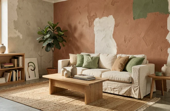
Choosing a wall or textile color depends less on annual trends than on how you manage incoming light, the nature of the substrate, and the surface-area ratio between shades. Understanding these technical factors makes it possible to create a cohesive palette without relying on one-size-fits-all formulas.
Light reflectance value and choosing shades for each room
Every color has a light reflectance value (LRV) between 0 (absolute black) and 100 (perfect white). A wall painted in a shade with an LRV below 30 absorbs most of the available light, radically changing how spacious the room feels.
In a north-facing room with few windows, using a shade with an LRV below 40 on more than one wall creates a visual compression that artificial lighting alone can be hard to correct. Deep shades (burgundy, forest green, midnight blue) work better as an accent on a single wall, paired with adjacent surfaces with an LRV above 65.
In a south- or west-facing living room, direct sunlight desaturates light colors around midday. Terracotta or buttery yellow—shades that Floor Covering Weekly forecasts among the rising color families for 2026—gain depth in direct sunlight rather than looking washed out.
We recommend testing a sample patch of at least 50 x 50 cm on the intended wall and viewing it at three different times of day before making a decision. A paint-pot sample does not show the final result.
Color combinations in interior design: moving beyond the 60-30-10 rule
The 60-30-10 split (dominant, secondary, accent) is everywhere. It has the advantage of being simple, but it locks the composition into place and tends to produce predictable results. In practice, the ratio depends on the difference in value between the chosen shades, not on a fixed percentage.
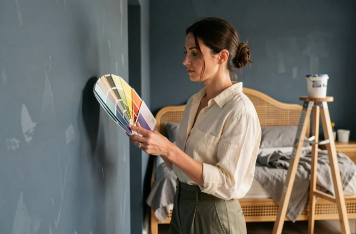
Two colors with similar values (the same level of lightness) can cover equivalent areas without creating an imbalance. Sand beige and sage green, both in the LRV 45-55 range, work equally well across walls and textiles. By contrast, navy blue (LRV around 10) paired with off-white (LRV around 80) calls for a clear imbalance in their proportions to avoid a checkerboard effect.
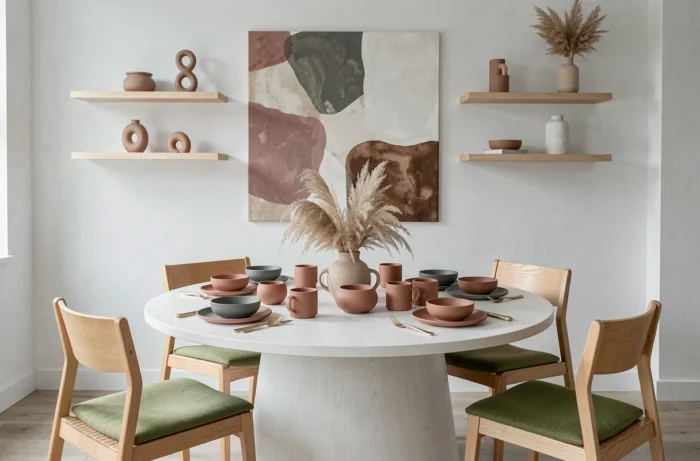
Rather than following a rigid ratio, it is more reliable to work with color temperature families. Warm shades (buttery yellows, terracotta, burgundy) and cool shades (lavenders, blues, blue-grays) both feature in 2026 palettes, but combining them in the same room calls for a neutral element (light wood, linen, polished concrete) to bridge the tension between the two families.
The resources available on interior design according to Dofacto Design & Déco illustrate this approach of composing by temperature rather than by isolated color.
Color palettes and materials: finish makes all the difference
The same paint color looks different in matte, satin, or gloss finishes. Matte diffuses light and softens saturation, while gloss concentrates reflections and intensifies the shade. On a textured wall (lime plaster, fine stucco), matte reveals the grain and adds depth. On a perfectly smooth wall, it highlights every flaw.
The choice of finish also interacts with the surrounding materials. Raw wood furniture (oak, walnut) adds warmth, shifting how the adjacent wall color appears. A gray stone countertop or polished concrete floor cools the palette. Wall color is always perceived in relation to the room’s fixed materials.
- Light wood (beech, birch, ash): lifts cool shades and keeps green or blue from looking clinical. It works as a warm neutral element.
- Black metal or brushed brass: heightens contrast and adds visual weight to a pastel palette. Use sparingly in small details (light fixture, handle, frame).
- Linen or unbleached cotton textiles: absorb light and soften saturated colors. A natural linen cushion on a burgundy sofa reduces the perceived intensity of the shade.
- Natural stone or matte tile: grounds the palette and establishes a base value that is difficult to change. The floor color shapes the entire composition.
VOC emissions and air quality: an often-overlooked interior design factor
Updating your interior often involves painting, and paint releases volatile organic compounds. Mandatory labeling introduced in September 2013 classifies products from A+ (very low emissions) to C. An A+ label alone does not guarantee healthy indoor air: ventilation, drying time, and the presence of other new materials in the room matter just as much.
For a decorative renovation, checking the product’s technical data sheet in addition to its label helps you verify the recommended application conditions. Inadequate drying in a poorly ventilated room can keep emission levels high for several weeks, even with an A+-rated product.
- Ventilate the room for at least two hours after application, with windows on opposite sides open if possible.
- Wait for the full drying time specified in the technical data sheet before putting the furniture back.
- Avoid painting several rooms at once in an occupied home: VOCs build up in the indoor air.
2026 trends favor durable colors suited to the character of the space over a single shade repeated everywhere. This shift toward personalization makes it all the more important to choose products with a well-controlled technical composition, not just the right shade on the color chart.